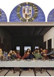
Completion of the Last Supper
Three years after the painting’s commission, Last Supper was completed. A digital reconstruction of what the painting might have looked like when it was finished reveals rich colors and captivating details that are barely visible today. da Vinci’s use of perspective in this painting is ingenious, and he was able to effectively use many new Renaissance techniques to create a vibrant and impactful masterpiece.
The central vanishing point of the painting is directly behind Jesus’s head, drawing the viewer towards the main subject of the painting. Close examination reveals that da Vinci actually hammered a nail into the center of the wall and cut thin incisions radiating out that guided his painting lines and helped his accuracy. However, the perspective is not perfect because the painting is so large that it appears different depending on the viewer’s vantage point as the viewer is closer to some parts of the painting than others. To remedy this issue, da Vinci applied complex perspective, using a mix of natural and artificial perspective, as well as optical tricks to minimize distortion. He designed the painting so that the perspective appears perfect when viewed from a door in the right wall, where the monks entered the refectory. He then created an artificial ideal vantage point 30 feet from the wall, at eye level with Jesus, again emphasizing Jesus as the focus of the painting. In the painting, da Vinci used the table to hide the lines where the floor hits the back and side walls, and he painted a cornice that hides the fact that the ceiling doesn’t extend all the way above the table. This effective use of optical tricks and complex perspective shows “his mastery of complex rules of natural and artificial perspective, but it also shows his flexibility at fudging those rules when necessary” (Issacson p. 281).
da Vinci also used newer painting ideas to create his masterpiece. Standard linear perspective had been well studied at the time, but “Leonardo’s most important contribution to the study of perspective was to broaden the concept to include not just linear perspective...but also ways of conveying depth through changes in color and clarity” (Issacson p. 274). Da Vinci included three windows in the back of the painting that look out into the far distance of a mountain range, and one can clearly see the blurriness and blueness of the mountains as a fantastic example of his aerial perspective. One can also see the impressive blue gradient of the sky, sfumato that adds to the realism of the painting. The windows extend the three dimensional space seemingly into infinity, contrasting the flatness of many previous paintings.
Jesus and the disciples surrounding him possess incredibly expressive emotion and vibrant, rippling movement. da Vinci continuously studied how to portray emotions using body language and gestures, believing that “‘a picture of human figures ought to be done in such a way as that the viewer may easily recognize, by means of their attitudes, the intentions of their minds’” (Issacson p. 282). Through his intensive human studies and detailed portrayal of his figures’ emotions, he uses the Renaissance concepts of naturalism and humanism to pay homage to the complexity of the human form and mind. da Vinci’s choice to not include any gold halos or gold background also helps focus on the human forms of the figures through its removal of anagogic space.
Finally, da Vinci incorporated the revolutionary concept of involving the viewer in the painting by adjusting the lighting in the painting – the light appears to come from an actual window high on the left wall of the refectory, which blends reality and imagination and involves the viewer in the painting.
While da Vinci used many of these new and complex techniques, he also referenced past versions of The Last Supper through his decision to put all of the figures on the back side of the table. He was certainly capable of painting people on both sides of the table, but putting them all on one side maintains this tradition and does not shock viewers with its boldness. At the same time as he is referencing the past, he incorporates new ideas as the figure placement also allows the viewer to clearly see Jesus and each disciple’s face, body, and movements, emphasizing their emotions as da Vinci wanted and adding to the effect of the viewer being included in the painting.
Sources:
Leonardo da Vinci's Last Supper. (June 21, 2012). Retrieved from http://www.italianrenaissance.org/a-closer-look-leonardo-da-vincis-last-supper/
Issacson, W. (2017). The Last Supper. In Issacson, W, Leonardo da Vinci. (pp. 273-292). New York, NY: Simon & Schuster
Image Sources:
Bando, K. (2016). Digital Reconstruction of The Last Supper. [Image]. Retrieved from http://www.leonardoresearch.com/The%20Last%20Supper.html
The Last Supper Perspective (n.d.) Retrieved from https://www.leonardodavinci.net/the-last-supper.jsp#prettyPhoto

