Created by Faith Klein on Sat, 11/18/2023 - 19:17
Description:
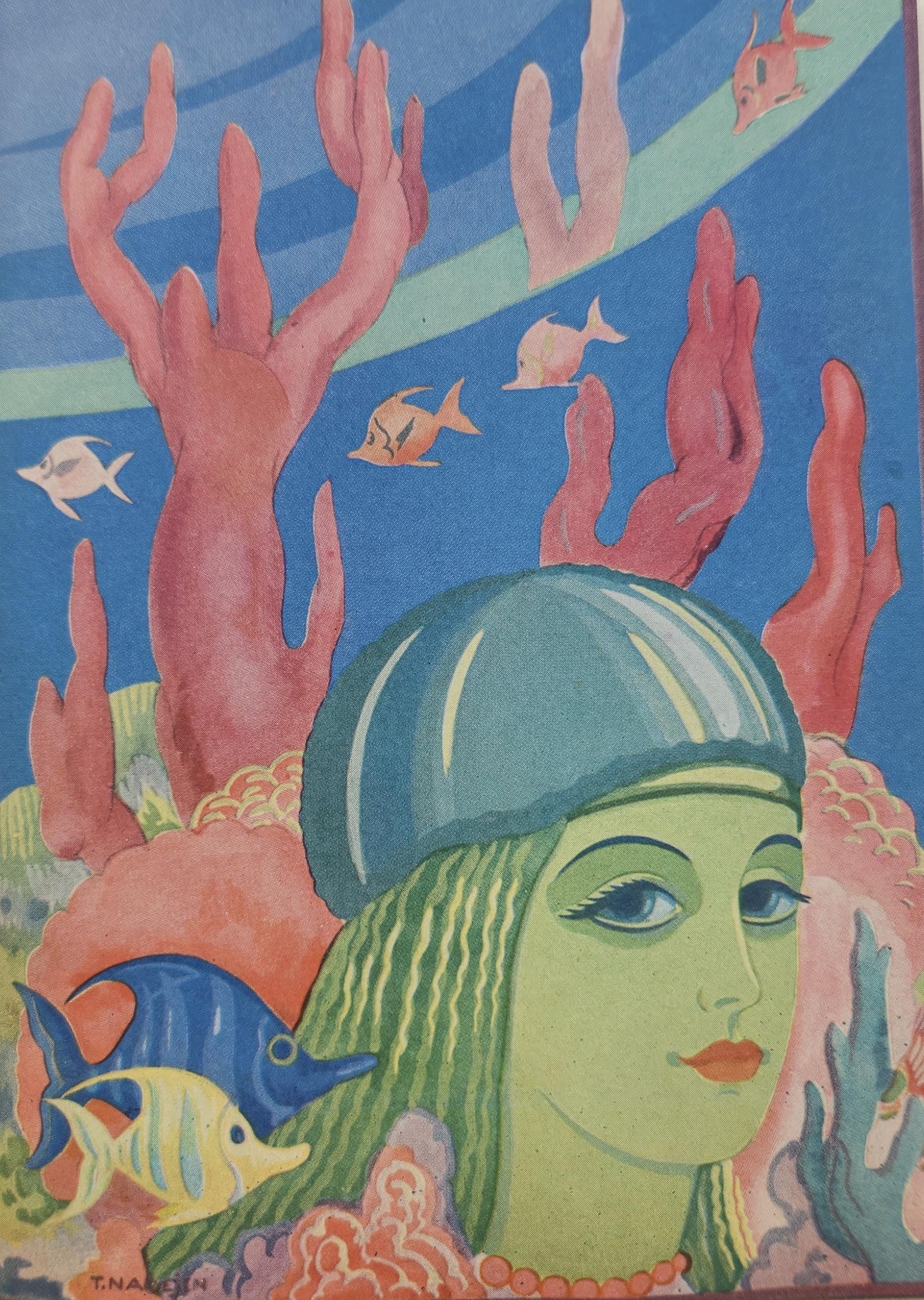
Caption: "And she sank down into the water, trembling with a strange fear."
This illustration illustrates the moment the mermaid went back into the sea waiting for the fishermen. It’s in color rather than black and white which helps illustrate the moment and make it stick out more on the page. The illustration is the entire right side of the page and there’s a small caption on the left side when the book is opened that says, “And she sank down into the water, trembling with a strange fear.” This illustration makes this showcase the importance and power of this moment by using the color and making it appear large on the page. The illustration shows the mermaid in the front of the illustration with coral and the water in the background. At the top of the picture are ripples showing how the mermaid is under the water which adds to the effect that she’s almost sinking to the bottom because of her despair. This is during the story when she finds out that the fisherman has chosen the soul over her, and she sinks down to never see the fishermen again because of his disloyalty. There’s fish right around the ripple which showcases how she’s sinking as well because the fish are at the surface more swimming around. This illustration uses the Art Deco style just like the other illustrations in this version of the story. The colors are out of the ordinary for what you would expect for the complexion of the mermaid as well. However, this one isn’t as out of the ordinary color wise as the other illustrations. The lips on the mermaid are a flesh color like we could expect. The fish and coral are all brightly colored, however that would be considered normal because in real life the underwater habitats tend to have a lot of color as well. The geometric part of Art Deco style isn’t necessarily showcased in this piece as it was in the other illustrations. The lines aren’t as geometric and rigid, instead they flow more. The things that stick out to me the most are the mermaid as she is the focal point of the entire illustration. I wonder what is on her head and what it means as I don’t remember anything from the story talking about a helmet or hat of some sort? I think that’s what I’d ask the illustrator of this piece. The other thing that sticks out to me is that she’s definitely conventionally beautiful. The illustrator obviously needed the mermaid to be conventionally beautiful for the story as the fisherman is so devoted to her he gives up his soul so it makes sense that she would have to be drawn very beautifully. The other part that really sticks out is the coral that is behind the mermaid. They seem very tall like they would almost point out of the water at the top because they’re so big. Otherwise it might just be the angle that it’s at to make them appear that tall from the point we are at in the illustration as the viewer.


