Created by Faith Klein on Wed, 11/08/2023 - 15:24
Description:
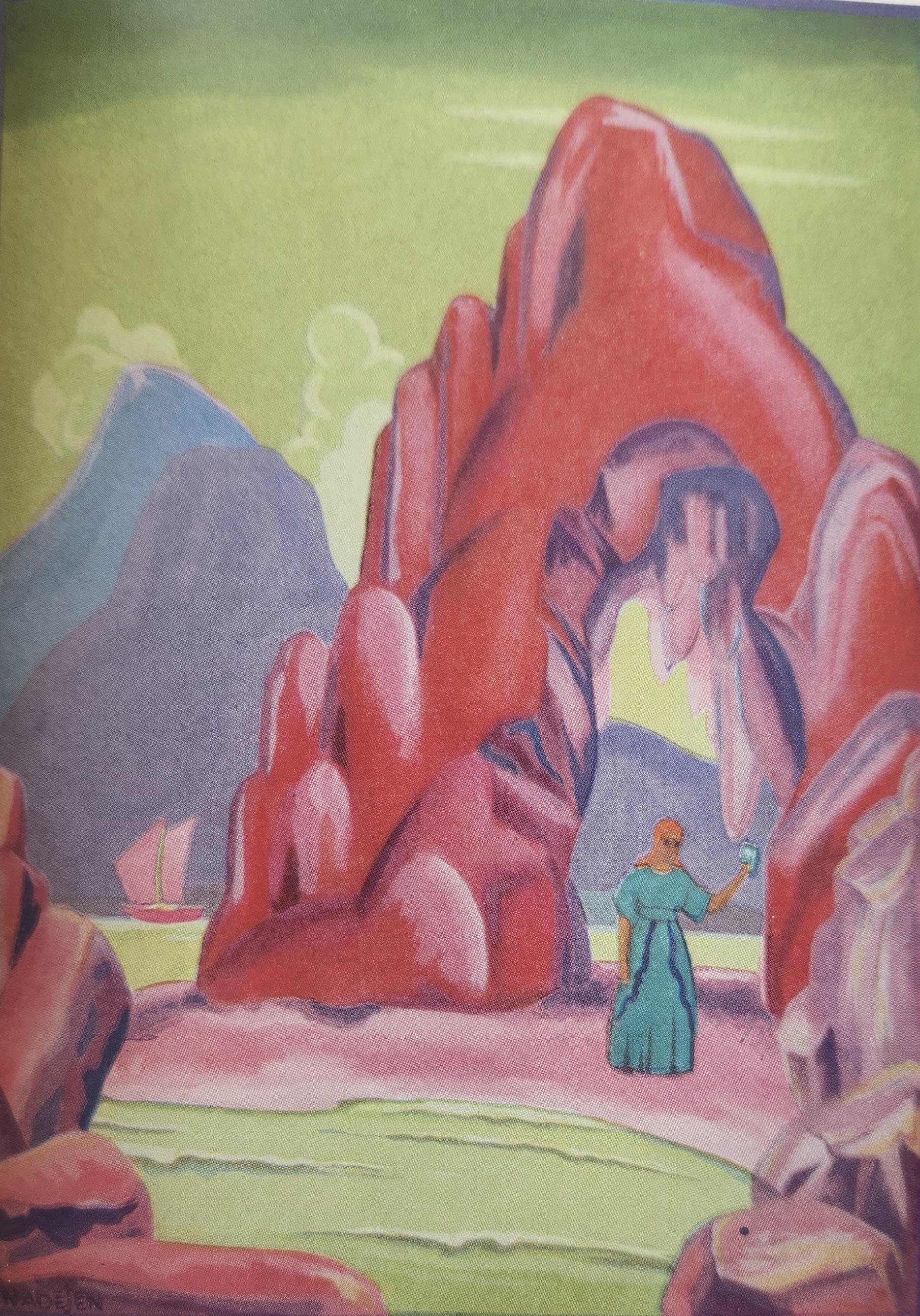
This illustration is showing the moment in “The Fisherman and His Soul” where the witch that was in the cave is waiting for the fisherman to show up and ask for her help in getting rid of his soul so he can become the partner of the mermaid. This image is in color and is a full page illustration with one small sentence on the page beside it. This illustration makes this moment powerful because we can see just how isolated the witch appeared to be and it makes it clear to see that with her all alone in this huge, magnificent cave. I think it also shows how the witch was an outcast within the town that the fisherman lived in. It seems like people such as the priest or other people within the town didn’t necessarily think of her as a person that someone should go to for advice like the fisherman was looking for. The witch is very isolated in this photo and showcases the way that she was an outcast in the town. I also noticed that it seems like this picture is from the angle of someone almost hiding trying to capture an image of the witch. It’s like the person seeing this or painting this is behind the rocks and is hidden. I think that’s important to this image too as it shows the outcast attitude of the town and people around the cave where the witch lived. This picture is part of the “Art Deco” style from the 1920s and 1930s. The shape of the cave and the background are in more geometric shapes rather than natural lines of caves and mountains. Everything is more rigid and geometric rather than smooth like caves and mountains are in other paintings or in real life. Another way that this shows the Art Deco style is the coloring. The cave is pink and the sky is greenish rather than something natural like blue or gray. I would say that the most memorable parts for me of this illustration would be the pink cave structure as well as the blue, turquoise type dress that the witch is wearing. I think that the cave is memorable and sticks out to me because I think that the illustrator meant for this to be the main point of the work. It’s the first thing your eyes go to because of the color and how big it is. You also see it right away because of where it is on the page and everything around it makes it look like that is what we are supposed to focus on immediately when seeing this. The dress sticks out to me as well because it’s a different color than anything else in the illustration. Everything else is bright colored but they all seem more muted compared to this dress color. All the other colors tend to go together, but this blue sticks out as well. This seems to make it easier to spot her and see her. I feel like this blue is meant to make it so that she is in the front with the pink cave as well.


