The 1890s Print Revival and the Book Beautiful
Clemence Housman’s The Were-Wolf’s (1896) laborious design with the collaboration of her brother Laurence would not have been possible without the Book Beautiful movement. It featured a revival in appreciating books as works of art, the art of decoration, fine materials, and artisanal labour to produce an aesthetic object as valued as the words contained within. This print revival, with its connotations of good taste, was debated as at odds with mass publishing (Ricketts viii). One firm which managed to somewhat span commercial and aesthetic ideals was The Bodley Head, which eventually published The Were-Wolf.
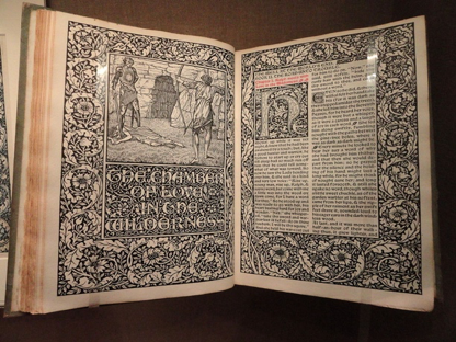 Figure 1. The Well at the World's End, design by William Morris, Hammersmith, Kelmscott Press, 1896. Manuscript exhibit in the National Gallery of Art, Washington, DC, USA. Wikimedia Commons
Prominent advocates of embellished texts included William Morris and his Kelmscott Press, inspired by medieval printing practices; T.J. Cobden-Sanderson and The Doves Press; and Charles Ricketts and the Vale Press. Their objectives expanded from the Arts and Crafts movement, a response to the mass production of the Industrial Revolution. The movement valued individual craftmanship over profit and idealized a mediaeval craftsman’s guilds model. The tomes of past centuries, which took years to complete and spared no precious materials, were standards to aspire to. To such exacting principles, everything down to the design of typefaces and the mixing of glues was enacted to be genuine, including book binding and covers (Wilde 103). Newly commissioned fonts blended old hand lettered and carved typefaces into exclusive typesets (Stillwell 11-15). The use of red for important passages (rubrication) and initial letters was a centuries-old legacy brought forward by the new Book Beautiful presses, such as Morris’s Kelmscott Press, which influenced Laurence Housman’s designs (Davenport 67). In the same spirit of rubrication, The Were-Wolf’s decorated title page is printed in a warm reddish-orange ink.
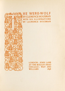 Figure 2. Decorated Title Page for The Were-Wolf, designed by Laurence Housman. Engraved by Clemence Housman
Granted, The Bodley Head’s publications could not meet every exacting Book Beautiful standard and remain profitable. Housman’s The Were-Wolf is bound in cloth, which Sanderson disdained for not preserving the embossed lettering and gold used in fine press covers and spines (Wilde 103). The materials Sanderson espoused, such as fine or carefully manipulated leathers, were not the most practical for even relatively smaller print runs, let alone for trade presses like The Bodley Head. However, one need only examine Housman’s slim volume to appreciate its considered design and execution. Laurence’s precisely entwined pomegranate motif over the spine, cover, decorated title page, and initial letter, and Clemence’s beautifully detailed wood engravings all attest to the physical book as more than a medium. The aesthetic holds a power for readers to encounter just as the raw text does.
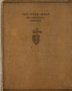
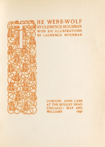
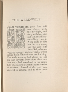
Figure 3. Laurence Housman's repeating pomegranate motif for The Were-Wolf
The Bodley Head innovated new marketing approaches as it sought to span the world of the Book Beautiful and the expanding middle-class book market. This venture began in March 1889 when Elkin Mathews and John Lane founded their new publishing firm called the Bodley Head, named after a prominent figure in history, Sir Thomas Bodley, of no relation to either partner (Stetz 81). Sir Thomas Bodley had founded the impressive Bodleian Library at Oxford. His historic name invested a sense of legitimacy and tradition into the firm’s ensuing publications. Though they did not possess a large starting budget, Mathews and Lane used this circumstance to their advantage. They advertised the scarce and discontinued materials they were using as limited and rare and they named their unknown illustrators in advertisements as if they carried a reputation for excellence already. What seemed at first a nostalgic touch—sometimes leaving pages sealed together in pairs by a crease at their edge, reminiscent of the practice of hand-cut leafs—saved on expenses (Stetz 74). Following the Book Beautiful movement’s call for deliberate spacing on pages and considered margins meant smaller works could be expanded and published as slim, aesthetically-pleasing volumes which called for purchasing individual pieces rather than compilations. Ricketts remarks on this business-savvy application as manipulation (Books X). Lane and Mathews commissioned their books as works of art with jacket designs coordinated spines and title pages, and they advertised heavily (Stetz 76).
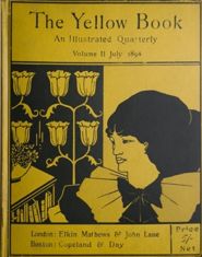 Figure 4. Aubrey Beardsley's cover design for The Yellow Book, vol 2 (July 1894). Yellow Nineties Online. Public Domain.
Though the Bodley Head’s output was diverse, publicity grew from their more controversial and best-selling published works. Before the firm accepted the manuscripts, they would have been undesirable and/or unknown, unlikely to command high prices or entice other publishers to take a chance (Stetz 72). In 1894, Mathews left the partnership and Lane went on to publish many more books in the “New Woman” and “decadent” genres, the most famous being The Yellow Book, a quarterly of art and literature renowned for its controversial works and authors.
Even in the larger publishing industry there was a recognition of a public appetite for books exquisite in their appearance. Clemence’s wood engravings would have been time-consuming and costly compared to other illustrative techniques (such as half-tone engravings) available at the time of publication. By commissioning her wood engravings after Laurence’s illustrations, and commissioning Laurence himself to design the book as a whole, The Bodley Head demonstrated its valuing of their artistic abilities over less expensive methods. The Bodley Head recognized and capitalized on the public’s desire for attainable art, with Housman’s The Were-Wolf as one of many seemingly contradictory titles in terms of their levels of production and pricing versus the attributed fineness of the book as material object.
Hayley Horvath, Ryerson University, 2018
Citation: Horvath, Hayley. "The 1890s Print Revival and the Book Beautiful," Clemence Housman's The Were-Wolf, edited by Lorraine Janzen Kooistra, Hayley Horvath, et al, COVE Editions, 2018, https://editions.covecollective.org/edition/were-wolf/1890s-print-revival-and-book-beautiful
Works Cited
“Arts and crafts movement.” Encyclopedia Britannica.
Cobden-Sanderson, T. J. Ecce mundus : industrial ideals and the book beautiful. Hammersmith Publishing Society, 1902.
Davenport, Cyril. Beautiful Books, London: Methuen, 1929.
Housman, Clemence. The Were-Wolf. John Lane at the Bodley Head, 1896.
Ricketts, Charles. A Bibliography of the Books issued by Hacon and Ricketts. Ballantyne Press, 1904.
Stetz, Margaret Diane. “Sex, Lies, and Printed Cloth: Bookselling at the Bodley Head in the Eighteen-Nineties.” Victorian Studies, vol. 35, no. 1, 1991, pp. 71–86. www.jstor.org/stable/3827765. Accessed 3 April 2018.
Stillwell, Margaret Bingham. The Influence of William Morris and the Kelmscott Press. E.A. Johnson & Co, 1912.
Wilde, Oscar. “Beauties of Bookbinding.” Pall Mall Gazette, November 23, 1888. Rpt. The Complete Works of Oscar Wilde 6 (Bigelow, 1909), pp. 103–4.
